Sector Rotation & Market Regime Dashboard
A unified sector rotation, macro, and news dashboard with regime scoring and a stock scanner, replacing a multi-tool morning routine.
The Problem
Understanding which market sectors are leading or lagging, and whether the broader market is in a risk-on or risk-off regime, normally means checking several separate tools — a sector-performance heatmap here, an economic-data terminal there, a news feed somewhere else — and manually synthesizing them into a coherent view. I wanted a single dashboard that pulled sector rotation, macro data, and news context together into one market-regime view, plus a stock scanner, so I could go from “the market is doing X” to “here are candidate tickers” without switching tools.
The Solution
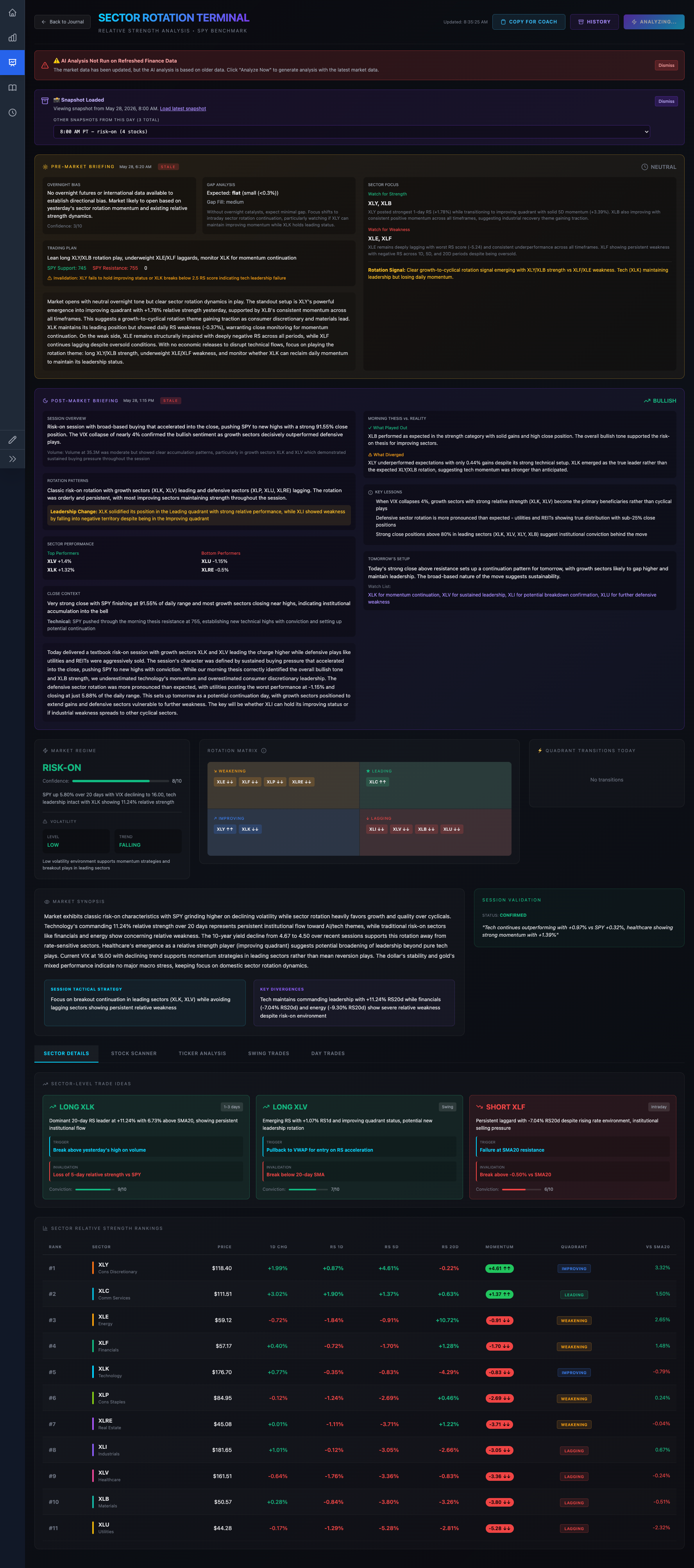
A sector dashboard that shows real-time sector rotation and ranking, a market-regime read — risk-on/risk-off, momentum posture — built from a mix of price and macroeconomic data, and pre/post-market recap summaries, alongside a stock scanner that surfaces candidate tickers matching the current regime. It brings price data, Federal Reserve economic data, and news context together on one screen instead of three or four separate tools, with an AI layer that turns the combined signal set into a plain-language market read.
Outcome & Impact
The dashboard consolidates what used to be a multi-tool morning routine — checking a sector heatmap, a macro calendar, and a news feed separately — into a single screen checked before and during market hours, backed by 73 commits of iteration on sector-specific logic and UI. It combines three independently rate-limited external data sources behind a caching layer, and connects the resulting regime read directly to a stock scanner and pre/post-market recap output rather than leaving it as a passive dashboard.
| Metric | Detail |
|---|---|
| Usage | Checked pre-market and intraday as part of a regular market-monitoring routine |
| Development volume | 73 commits touching sector-specific code |
| Data sources unified | 3 independent external APIs behind one caching layer |
| Output | Sector rotation matrix, regime classification, stock scanner, pre/post-market recaps |
My Role & Contributions
| Aspect | Detail |
|---|---|
| Role | Sole architect and engineer, solo personal project |
| Team size | 1 |
| Timeline | Built and iterated over the toolkit’s roughly year-and-a-half lifespan; checked pre-market and intraday as part of a regular market-monitoring routine |
| Scope | Sector rotation matrix and rankings UI, market-regime scoring logic, integration with a macroeconomic data provider and a news API, the stock scanner, and pre/post-market recap generation |
| Key decisions | Combined price-based sector rotation with macro data, rather than price alone, to score market regime, since sector leadership and macro conditions often diverge and either signal alone is misleading; built a caching layer in front of the external data providers to keep the dashboard responsive despite rate-limited upstream APIs; kept the scanner and the regime dashboard on the same shared market-data context so scanner results reflect the same live picture the regime view shows |
Technical Overview
[Equities API] ------+
[Fed Economic Data API] --+--> [Sector/Regime Scoring + Cache] --> [Sector Dashboard UI]
[News API] -----------+                    |
                                  [AI regime narrative] --> [Recap + Candidate Ideas]
The backend aggregates three external data sources — an equities provider for sector-constituent price and performance data, a Federal Reserve economic-data API for macro indicators, and a news API for headline context — behind a Redis-backed caching layer, since all three upstreams are rate-limited and a live dashboard can’t afford to hit them on every page load. A scoring layer combines price-based sector rotation with the macro data to classify the current market regime, which feeds both the rotation matrix and rankings UI and a Claude-generated plain-language narrative used in the pre-market and post-market recap views. A separate stock scanner runs against the same underlying data to surface candidate tickers matching the current regime, rather than existing as a disconnected screener.
Caching and rate limits
Because sector rankings, macro data, and news all come from separate rate-limited third-party APIs, a dedicated cache layer with explicit status and invalidation controls sits in front of all three, so the dashboard stays responsive and doesn’t get rate-limited during market hours.
Challenges & Key Decisions
Combining price and macro signals into one regime read without either one dominating
Sector price momentum and macro data — rates, inflation prints, and the like — each tell a different part of the story and don’t always agree; price can lead or lag macro releases by days or weeks. Rather than picking one signal as authoritative, I built a scoring approach that weighs both, and surfaced the underlying rotation matrix and macro data separately in the UI as well, so I can see the components of the regime read, not just an opaque score.
Staying responsive against three separate rate-limited APIs
Equities data, Fed economic data, and news each come from different third-party providers with their own rate limits, and a dashboard checked repeatedly through market hours can’t hit any of them on every load. I built a caching layer with explicit status and invalidation endpoints in front of all three sources, so the dashboard serves cached data by default and only refreshes on a controlled schedule or explicit request.
Connecting regime analysis to actionable output, not just a readout
A regime dashboard that just reports “risk-on” or “risk-off” is informational but not directly actionable. I connected the regime and rotation data to a stock scanner and a candidate-ideas view that surface tickers consistent with the current regime, and to pre/post-market recap summaries, so the dashboard produces something actionable rather than just a status readout.
Lessons Learned
- A single “regime” score needs its visible components, not just its output. Showing the rotation matrix and macro data alongside the combined regime read, rather than only the final classification, made the dashboard something I trust and can sanity-check rather than a black box.
- Caching design has to match the shape of the upstream constraints, not just be a generic TTL. Building explicit cache status and invalidation controls in front of three differently rate-limited APIs mattered more than a one-size-fits-all cache policy would have.
- A dashboard earns daily use by ending in an action, not just a readout. Connecting regime analysis to a scanner and candidate-ideas view turned this from a “nice to check” screen into one worth checking regularly.
Screenshot
The Sector Rotation Terminal view: pre/post-market AI briefings, the risk-on/risk-off regime read with the rotation quadrant matrix, sector-level trade ideas, and the full relative-strength ranking table.